10 Feb 4 Brilliant Women of Minimalism
By the 1960s, repetitive compositions and industrial materials had eclipsed the spontaneity and expressive brushstrokes that characterized Abstract Expressionism. The proliferation of grids, concrete cubes, and bare fluorescent lights into the gallery space frustrated some critics—and continues to puzzle many museum-goers to this day—but ultimately triumphed as a radical challenge to the teleology of art as it had been understood for centuries.
Minimalist artists sought to upheave preconceived notions of art as a vehicle for representation or self-expression, which often manifested in Abstract Expressionism as aggrandizement of the artist’s intuition and ingenuity. Instead, Minimalists reduced art objects to their most essential geometric forms, emphasizing the viewer’s perceptual experience of an object in space rather than any subject matter or subjective message set forth by the artist. As painter Frank Stella famously remarked, when it comes to Minimalist art, “what you see is what you see.”
The trend was not recognized as a movement until the 1966 “Primary Structures” exhibition at the Jewish Museum in New York, which united disparate American and British artists under the umbrella terms “Reductive” and “Minimal Art.” But no movement is monolithic, and not unlike the Abstract Expressionists before them, Minimalist women artists were few and far between—and often misunderstood. Anne Truitt was one of only three women in the “Primary Structures” exhibition, and Agnes Martin, long heralded as a master of Minimalism, eschewed many of the style’s tenants. Below, meet four key female players in the Minimalist movement, who each pushed the boundaries of the movement and art as a whole.
Agnes Martin
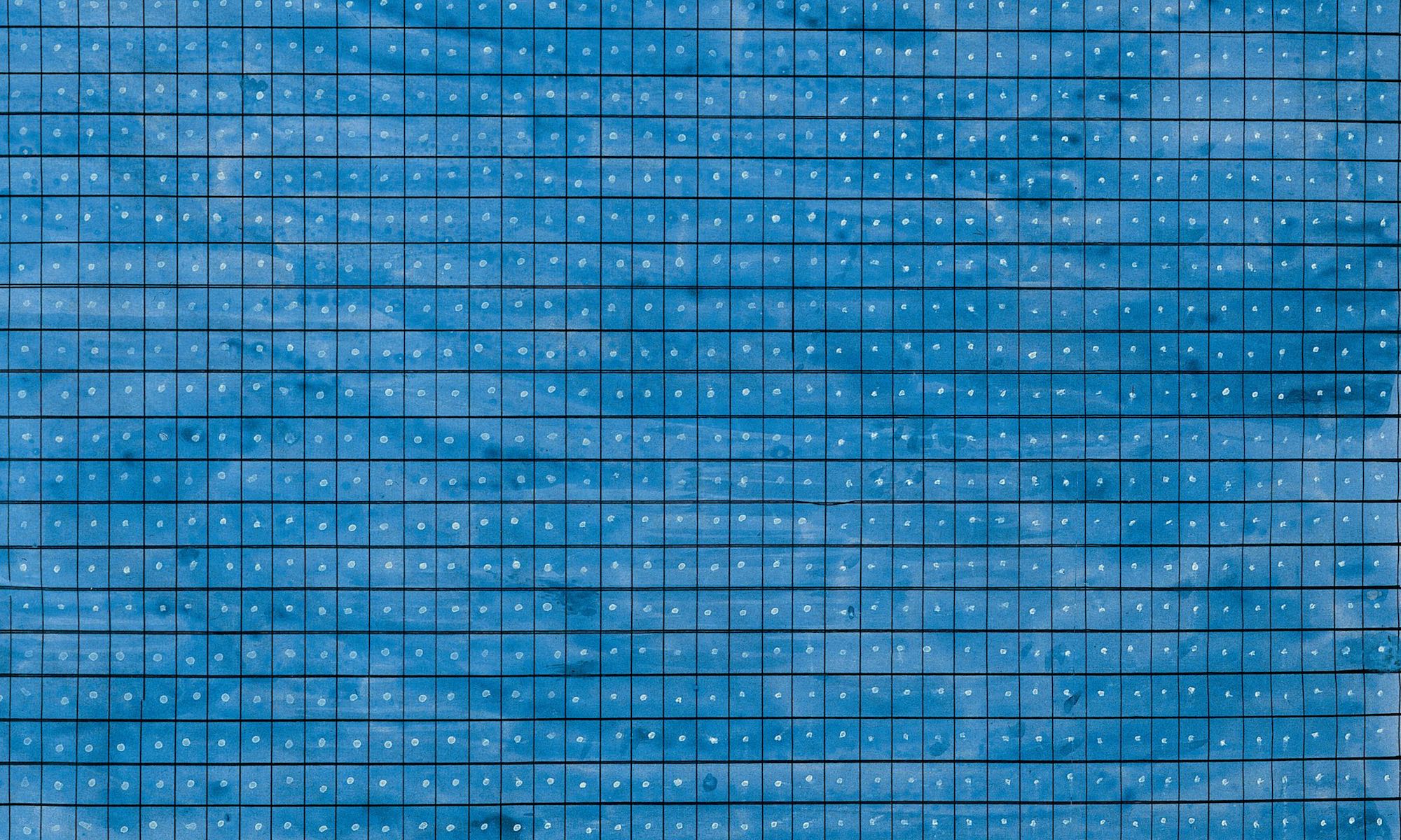
Though trained as a teacher and practiced in naturalism, Agnes Martin began pursuing abstraction while living in Taos, New Mexico. After garnering the attention of galleries in 1957, Martin relocated to New York. Working among the experimental circles of Ellsworth Kelly, Jasper Johns, and Robert Rauschenberg, Martin developed her own abstract vocabulary: graphite grids and stripes meticulously drawn by hand across light washes of color on six-by-six foot square canvases. Formally, Martin shared Minimalism’s interest in simplified forms and repetitive mark-making. Martin’s work is unique, however, in her melding of Minimalism with Color Field abstraction, or the use of vast fields of color on canvas to envelop the viewer in a transcendent experience. Martin’s geometric grids sit atop serene washes of color that draw the viewer into the dizzying compositions, which upon closer inspection reveal slips and imperfections in the pencil markings—moments of human presence in otherwise rigid matrices. Peculiarly for a Minimalist, Martin often alluded to nature with her titles—“Summer,” “The Islands,” “A Clear Day,” all references to the exterior world Minimalists tended to avoid.
Anne Truitt
Much like Agnes Martin, Anne Truitt made work that appeared Minimalist in form but departed from the style conceptually. While Minimalists sought to create objects devoid of subject matter, Truitt embraced the potential to convey nostalgia, memory, and emotion through simplified forms. Inspired by the primary role of color in the works of Barnett Newman and Ad Reinhardt, Truitt became known for her series of totemic wooden sculptures sanded down to factory-smooth surfaces and decorated with blocks of shiny acrylic paint. Critic Clement Greenberg counted Truitt among the forerunners of Minimalism upon seeing her first solo show in 1963, but Truitt rejected the label—for Truitt, her sculptures were not mere objects, but extreme distillations of reality. Her 1978 sculpture “Breeze,” for example, is a white, life-size plinth divided by slim bands of blue and green that together become an unexpected evocation of a landscape. As Truitt stated in a 1987 interview, “I have never allowed myself, in my own hearing, to be called a minimalist. Because minimal art is characterized by nonreferentiality. . . [my work] is totally referential. I’ve struggled all my life to get maximum meaning in the simplest possible form.”
Eva Hesse
Eva Hesse adopted the serial compositions and industrial forms of Minimalism but discarded any semblance of order, cleanliness, or mechanization that had previously been attached to them. Instead, Hesse used industrial materials to explore entropy, irregular forms, and the fragility of the human body, a strategy that was eventually dubbed Post Minimalism. Take her 1966 sculpture “Hang Up,” for instance. The work consists of a square metal frame—a shape and material used in Minimalist art to suggest stability and manufacturability—affixed to the wall and wrapped in strips of cloth, with a rogue wire protruding from the frame into the gallery space. The slumping wire belies the stability of the square frame, while the cloth recalls a bandaged bodily form. The cloth indicates another innovative departure from Minimalism—Hesse created objects that retained visual signs of their construction process, such as weaving, wrapping, or tearing, a Post Minimalist methodology known as Process Art
Vija Celmins
Vija Celmins trained as an artist in the 1960s on the heels of Abstract Expressionism and at the height of Minimalism, both of which decried realism and illusion. Despite those conventions, Celmins took to making painstakingly detailed renderings of natural phenomena—most often obsessive facsimiles of oceans, skies, rocks, and spiderwebs. Though the forms in Celmins’ photorealistic paintings and drawings are immediately recognizable, the subjects themselves are not the focus of the work. Rather, Celmins approaches her subject matter in the spirit of Minimalism, using recognizable forms to jar the viewer into examining their perceptual experience of the art object itself. Combining realist techniques with the sensibilities of all-over abstraction, Celmins zooms in on her subjects—removing horizon lines and any hint of context—resulting in a destabilized image. On the occasion of her 2018 retrospective at San Francisco Museum of Modern Art, Celmins explained, “The work is simply about itself, its own structure. I use images, but the images are pinned in the structure of the work.”
